
In a trade show environment, where dozens (or even hundreds) of booths compete for attention, color is one of your most powerful tools. It’s the first thing people notice from a distance, it sets the mood of your booth, and it silently communicates your brand’s personality — all in a matter of seconds.
Choosing the right color scheme can mean the difference between being overlooked and becoming a destination. In this post, we’ll explore the most effective trade show color schemes, the psychology behind them, and how to select a palette that works for your brand and your goals.
Why Color Matters in Trade Show Booth Design
- Attraction: Color catches the eye faster than text or logos.
- Mood Setting: Different colors evoke different emotions (trust, urgency, excitement, calm).
- Brand Consistency: Colors reinforce identity and recognition.
- Navigation: Strategic use of contrast and color flow helps direct booth traffic.
- Memory: Color combinations are more memorable than words alone.
In short, smart use of color doesn’t just make your booth look better — it can direct behavior, reinforce your message, and increase engagement.
1. Red + White + Black: Bold and Energetic
Red is one of the most attention-grabbing colors you can use. It conveys energy, urgency, and power — perfect for industries like tech, automotive, sports, or health.
Best for:
- High-energy brands
- Product launches or urgent offers
- Brands that want to project confidence and speed
Use with caution: Too much red can feel aggressive. Balance it with white space and black accents for contrast and control.
2. Blue + White + Gray: Professional and Trustworthy
Blue is one of the most universally trusted colors. It conveys stability, calm, and credibility, which is why it’s used heavily in finance, technology, healthcare, and B2B industries.
Best for:
- Corporate, tech, or SaaS companies
- Booths focused on reliability and professionalism
- Brands looking to build trust over flash
Tip: Use brighter or deeper shades of blue to stand out. Navy and royal blue work especially well under trade show lighting.
3. Green + Earth Tones: Natural and Sustainable
Green evokes health, sustainability, and growth. When paired with neutral earth tones like beige, wood textures, or soft grays, it can create a calming, approachable environment.
Best for:
- Eco-conscious brands
- Health and wellness industries
- Food and beverage exhibitors
Bonus: Green can also work well for financial services (growth, wealth), especially when paired with gold or silver.
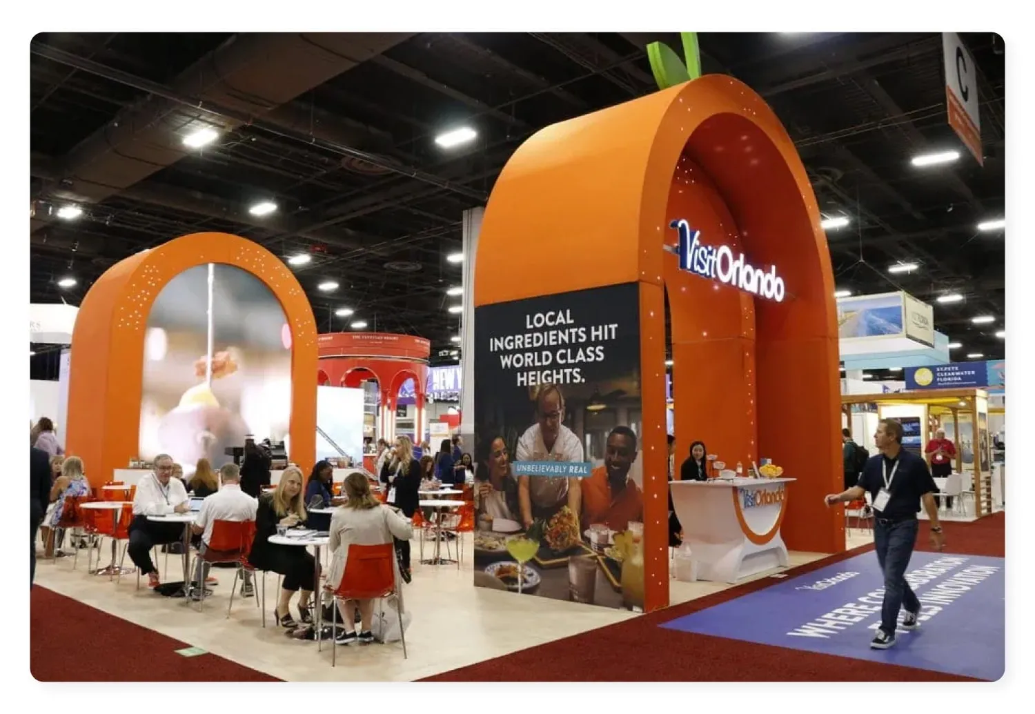
4. Orange + Charcoal: Friendly and Modern
Orange is vibrant, fun, and approachable — but when grounded with a darker neutral like charcoal or navy, it becomes more sophisticated.
Best for:
- Startups or challenger brands
- Consumer electronics or lifestyle products
- Brands that want to feel modern, without losing warmth
Caution: Like red, orange can feel overwhelming if overused. Use it as an accent or secondary color to draw attention to CTAs, signage, or product features.
5. Black + Gold: Luxury and Exclusivity
A classic combination for premium and high-end products. Black conveys sophistication and control, while gold adds elegance and exclusivity.
Best for:
- Luxury goods
- High-end services (private aviation, premium consulting)
- Booths designed to impress and attract VIPs
Design note: Use matte black backgrounds with metallic accents for a high-end look that feels both modern and timeless.
6. White + Pops of Bright Color: Clean and Minimal
White space is underrated in trade show design. A clean white backdrop paired with bright accents (like teal, coral, lime, or violet) can create a modern, minimalist feel that still draws attention.
Best for:
- Tech or design-driven brands
- Booths focused on one clear product or message
- Exhibitors that want to stand out by doing less
Benefit: It creates visual relief in a cluttered trade show environment, making your space feel calm and intentional.
7. Monochrome Palette with a Signature Accent
Sticking to a single tone (grayscale, blues, or muted tones) and then adding one high-contrast accent color (like neon yellow or electric blue) can guide the eye exactly where you want it.
Best for:
- Sophisticated brands with bold CTAs
- Product-focused booths
- Companies that want a balance of subtlety and impact
This style often works well with LED lighting and digital screens, reinforcing a tech-forward image.
Choosing the Right Color Scheme: What to Consider
- Your Brand Identity
Stick to your core brand colors where possible — consistency reinforces recognition. - Your Audience
Consider how your target market perceives color. Financial professionals may gravitate toward blues and grays, while younger audiences may prefer bold, saturated hues. - Venue Conditions
Trade show lighting can be harsh or dim — test how your colors will look under real conditions before committing. - Contrast and Readability
Make sure your text and graphics are legible from a distance. High contrast between background and foreground is key. - Psychological Impact
Colors influence mood and perception. Choose a palette that aligns with your emotional goal — trust, excitement, calm, curiosity, etc.
Final Thoughts
Color is not just a design choice — it’s a strategic decision that can significantly impact your booth’s visibility, engagement, and brand perception. Whether you’re going for elegance, energy, innovation, or trust, there’s a color palette that can help you communicate it — instantly.
Need help developing a color scheme that works for your brand and your next event? Our design team specializes in crafting custom booth experiences that blend creativity and strategy. We recommend ExpoMarketing.